
a tale of two colors (color, demystified)
Why are there no cookies at my house?
Why has this post not written itself? I asked it to more than a week ago. Why are my posts disobedient?
Why did my horsedogs knock over the Christmas tree?
Why does it get dark at noon?
Who came up with the idea to mix ground meat together with breadcrumbs and eggs, form it into a loaf shape and bake it? Were they burned at the stake?
I suppose I could look up the answers to most of those questions. But I could also be talking to you about colors. And my guess is that you're not really here for my scintillating meatloaf commentary.
(I really do hate it, by the way.)
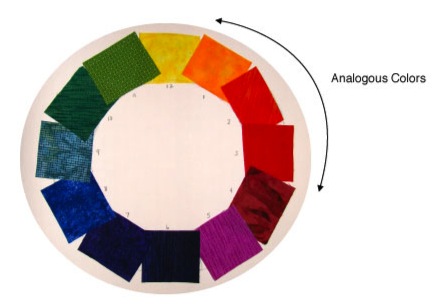
This is supposed to be part four of my Color, Demystified series. We've already tackled the most difficult color combinations, the complementary pairings of blue and orange, red and green, and purple and yellow.
Let's move on to some analogous color pairings.
Complementary colors are colors that are opposite each other on the color wheel. Analogous colors are next to each other on the color wheel. So, red and purple. Orange and yellow.
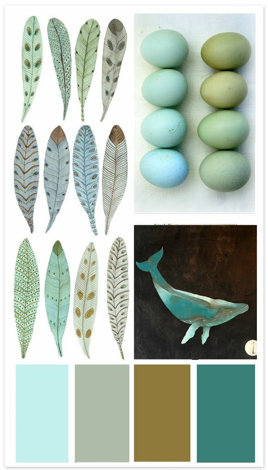
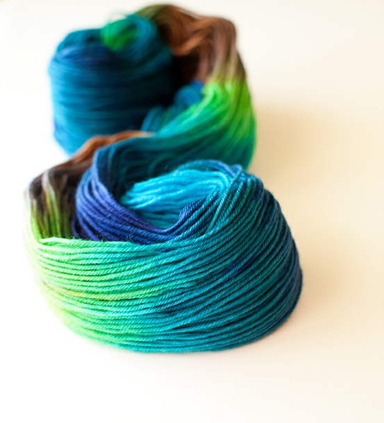
And some of my personal favorites: blue and green.
If my experience holds true, this is also one of your favorite color combinations, as some of our best selling colorways use blue and green together.
And really, it's no wonder given that such a large portion of our natural environment is one or both of these colors.
Heck, from space, the earth itself is blue and green.

Here's the good news: with analogous color groupings, there are no rules. Everything looks good together. It really becomes more about the feeling you want to create in your clothes, your home, your knitting, your design work.
On its own, blues are seen as serene, dependable, clean, and restful. At the lighter end of the spectrum, they can be icy. In the midtones (like turquoise), they are energetic and tropical. As blue deepens, it gets more serious.
Men in suits wear navy. Deep blues are conservative, confident, and authoritative.
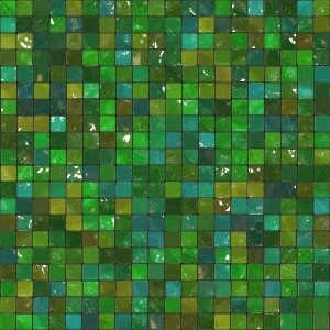
Green is a neutral color. Look at nature if you don't believe me. Nature puts green with everything.
Which means, guess what? that all blues go with all greens.
You can't do it wrong! How often has someone said that to you?
Like, almost never, right?
Guess what? You cannot do blue and green wrong.
Liberating.
So here are some of my favorite blue and green pairings. Use them, don't use them. You can't do it wrong.
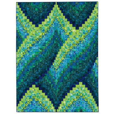
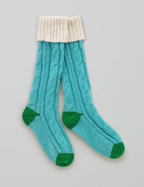
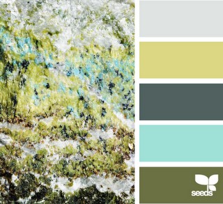
1. Aqua + Bright Green
How adorable are these socks? The pop of color at the heels and toes make them special.
I like the teal and turquoise with the chartreuse and kelly here. What a bold look for an interior space!
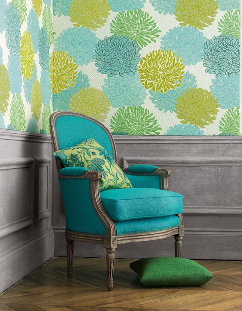
The combination of aqua and bright green is energetic. It feels like new growth, like spring, like the tender buds unfurling from the trees against the morning sky.
Here, it's paired with hints of mustard, which is an analogous color to green.
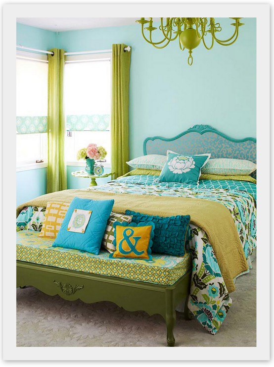
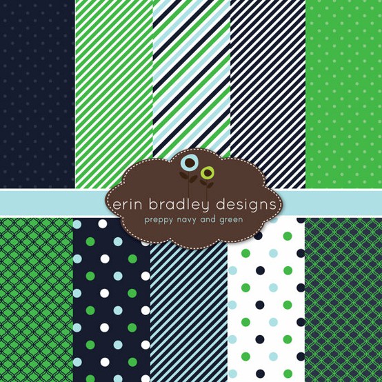
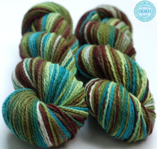
2. Navy + Kelly
Deep blue and bright green is preppy, classic, timeless, and clean. It looks equally good on men and women.
Oh, look. Erin Bradley thinks so too.
This is an interesting take on a nursery. Cool white, deep navy, and pops of aqua and kelly green.
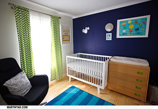
Navy and kelly have enough contrast to make a print (or colorwork) stand out, but not so much that the pairing becomes garish. This color combo would be a safe choice if you're knitting something as a gift.
3. Blue + Green + Brown
I really love mixing blue and green with brown. Like, a lot.
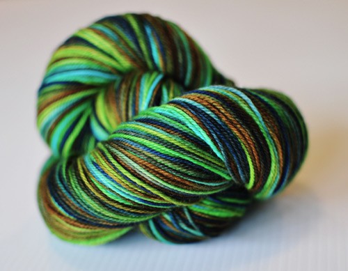
A lot a lot.
A lot a lot a lot.
The bright green scarf is what kicks this outfit up a notch. And the awesome boots and bag are certainly not hurting matters.
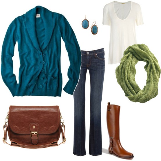
The grouping of blue, green, and brown is earthy but elegant, and quietly eye catching. It's not the flashiest combo in the box. But it's one that can fit into almost any context.
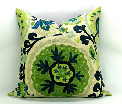
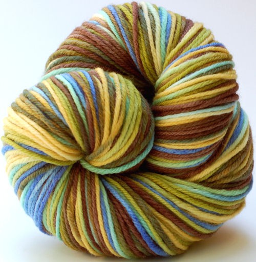
4. Olive + Teal
If you're looking for a hipper alternative to navy and kelly, try teal and olive. This combination is all over, oh, hmm, everything right now.
Home decor. Fashion. Event planning.
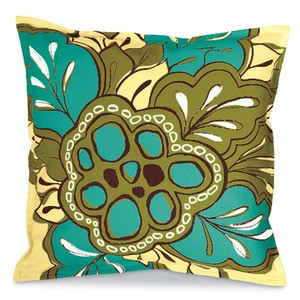
Olive and teal has a retro feeling that's popular today. It's just enough late 1970s/early 1980s to seem fresh again.
I'm seeing teal and olive paired with grays, which gives it more sophistication.
Another reason this combination is popular is that in its more muted forms, teal and olive have an heirloom, natural feel.
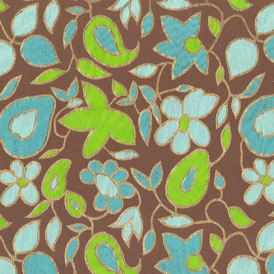
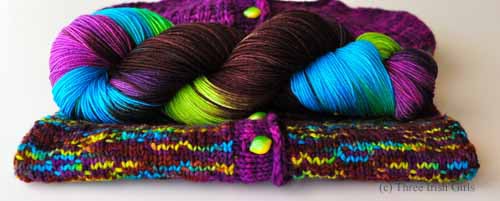
5. Blue + Green + Purple
Purple and blue are also analogous colors, which means that the combination of blue, green, and purple is a natural one.
Any time you add purple to a color combination, you up the wow-factor. Purple is mysterious and intriguing, and I'm in love with what it does to blue and green.
I love violet with teal, lime, and brown.
And oh, how I love magenta with lime and turquoise. And brown. I have said before that I could spend the rest of my life inventing colorways that have blue, green, purple, and brown in them.
I've created a Pinterest board dedicated to blue and green. You don't need an account to see it, so click here. If you want to join Pinterest (which you do, it's super awesome), you can use the contact button in the upper right, leave me your email address, and I'll send you an invite.
Let's recap what we've learned today:
1. There is no wrong way to do blue and green.
2. The person who invented meatloaf should have been burned at the stake. I'm going to google and see if, in fact, they were.
3. Which shades of blue and green you use together is all about the feeling you want to create.
4. Blue and green can be both timeless and trendy.
5. There are still no cookies at my house.
Thank you. And goodnight.
 Yarnista
Reader Comments (16)
I am SO glad I'm not the only one who thinks the meatloaf inventors should be burned at the stake... ;)
OK, I get you on the blue and green thing, and I've understood your other posts on this subject, but can we clear one thing up? Pink and orange together are bad, right? I see so many people wearing these colors together and it makes me cringe! On the other hand, I'm not known for my fashion sense. What's your take on pink and orange?
Thank you for another great post on color. I need all the help I can get. I love color but tend to stick to tried and true. Using your inspiration and guidance I just may break out of my box.
Meatloaf used to be a staple at our house. It was good for a dinner, then sandwiches for lunch the following day. No one complained.
Such pretty eye candy. :) yum!
I do have to say, my hubby made a turkey meatloaf, and wrapped it in bacon. Yum! And I hate hate hate meatloaf. :)
Mary,
You ask an interesting question. If you look at the color wheel above, you'll see that red and orange (and hence, pink and orange) are also analogous colors. Together, pink and orange remind me of tropical flowers (like this hibiscus: http://www.laulani.com/hibiscus_orange11.jpg) and juicy citrus/melons (grapefruit and oranges, cantaloupe and watermelon). Orange and pink together is a very youthful and attention-getting combo. I like it, but especially in the softer shade ranges, like coral and cantaloupe.
What is it about it that you don't like? Do you feel like the colors should match but don't? Like they're too close to each other but not exact?
Oh blue & green...how I do love you :) And blue and purple...and blue and purple and green....
Okay, you already know that about me ;)
Yes, exactly, they are so close that they clash. I can handle different shades of the same color (light pink next to deep pink), but the pink/orange combo makes me uncomfortable. Especially when worn by someone with red hair!
These posts on color have been really good and very helpful---thank you! I need all the help I can get!
I understand why you picked the blue and green to go togerher, but what made you think to add purple and brown to them? They look fantastic all together. Keep the color blogs going please, they help me alot. I try color combinations that I might not of because of these blogs and my yarn looks great.
Terri, purple in blue's other analogous color. And brown is a neutral! Rich browns make a palette more sumptuous. Lighter browns make a palette more relaxed, and in the case of blue and green, more beachy.
WAIT A minute-did you say horsedogS? I thought there was only one horsedog!
Have you been hiding horse dog?
I have to agree with you about blue and green-so wonderful together.
margieinmaryland
I am absolutely LOVING this series - it is making me think of color combos that I would have never conceived of! Thanks for continuing it!
Wonderful post - thank you!
I have never really gone about my color choices this scientifically, I usually go with my gut. But sometimes I just don't know which direction to go . . . The next time that happens I will know where to turn for inspiration!
I have tried signing up for Pinterest a couple of times, but I'm having trouble. At first they sent me a password but then it seemed like I waited to long and it expired. I contacted them, and they sent me a link, but still no luck! I'm sad because I feel like I am missing out on the party!
Sorry, I <3 meatloaf....and greens, blues and browns :D
you said that brown is a neutral color what are other neutral colors?
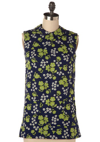
I love the chair with that floral wallpaper! I am actually looking for wallpaper with blue and greens to put in the back of a cabinet. Would you know where I could buy this? Thanks!